RAISOLUTIONS helps you to better understand your data and make more informed decisions. We have the expertise and the tools to develop a system that takes data from multiple sources and integrates it for easy access and a holistic view.
This can help youunlock the potential of all your data, from financials and operations to customer service, marketing strategies, and more.
With our services, you can have clear, interactive, and actionable reports that allow you to quickly analyze and interpret your data.
RAISOLUTIONS tailored to fit your needs, to give you an in-depth look at your data in real time.
Using analytics to understand your customer base, trends, and predictive behaviors leads to better decisions and marketing strategies. Our analytics reports provide you with information on customer acquisition and engagement, financial and operational performance, customer churn, and customer segmentation.
This data can be used to boost your customer experience and create lasting, meaningful relationships.We offer both automated and manual reports, so you can choose the right option for your organization.
MS Excel Power BI Pie Chart (Swipe Next) 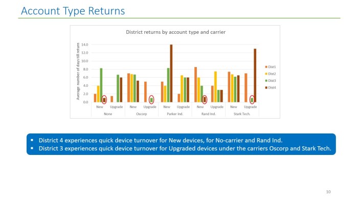
MS Excel Power BI Vertical Bar graph (Swipe Next–>) 
MS Excel Power BI horizontal Bar graph (Swipe Next–>) 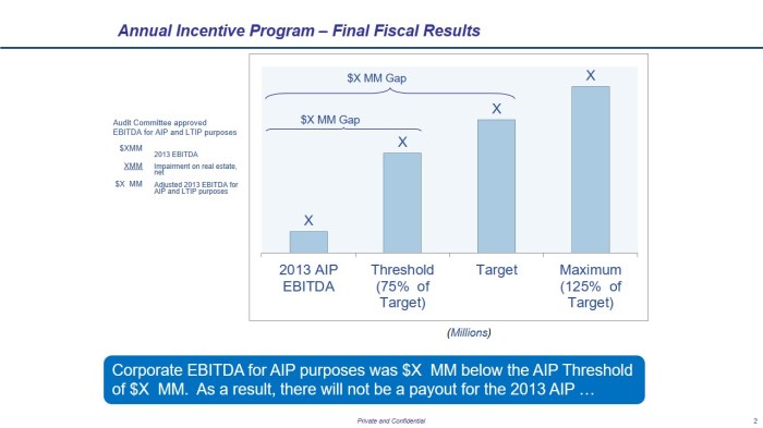
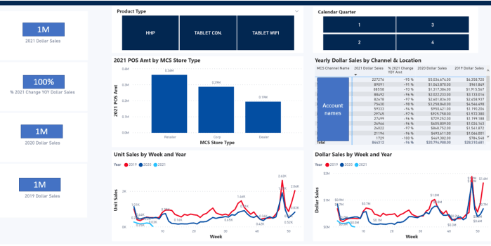
MS Excel Power BI Performance Incentive Dashboard (Swipe Next–>) 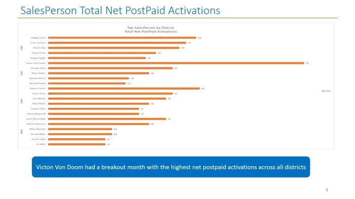
MS Excel Power BI horizontal Bar graph (Swipe Next–>) 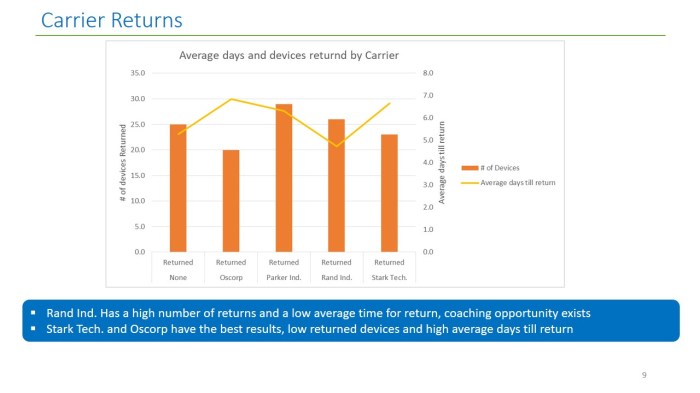
MS Excel Power BI Vertical Bar Graph with Trend line (Swipe Next–>) 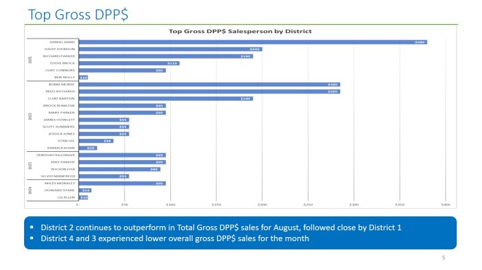
MS Excel Power BI Horizontal Bar Graph (Swipe Next–>) 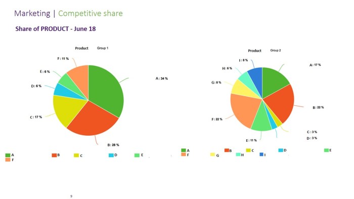
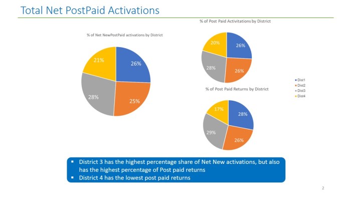
MS Excel Power BI Pie Chart (Swipe Next–>)
Our experts can help you detect trends, recognize outliers, and identify weaknesses in your data.
We also have powerful visualization tools, so you can quickly gain insights that drive your decision-making.
Analytics reporting is about how to make the most of your data.
You need to properly organize, mine, and analyze your data to extract meaningful insights.
The insights from analytics reports can be used to target specific customer segments, uncover weaknesses in processes and services, and reveal new opportunities.
With RAISOLUTION analytics reporting, you can create custom reports to uncover trends and highlight areas of improvement.
Power BI MS Excel Trending quality Dashboard (Swipe to view next) 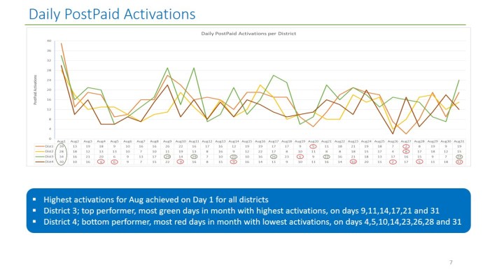
Power BI MS Excel Daily Sales Reports (Swipe next) 
Power BI MS Excel Turnover monitoring (Swipe Next) 
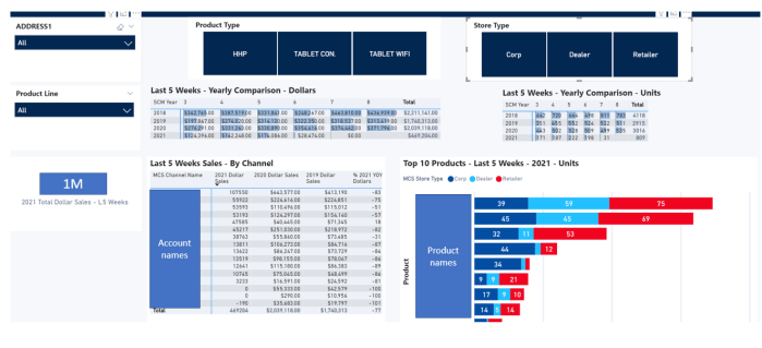
Power BI MS Excel Performance Histogram to Salesperson (Swipe Next) 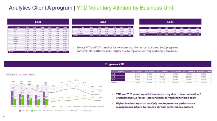
Power BI MS Excel Performance measuring quality (Swipe Next) 
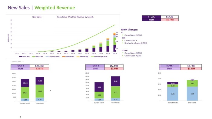
Power BI MS Excel Trend Analysis Reports (Swipe Next)
RAISOLUTION reporting can help you develop a detailed understanding of your customers and their behaviour.
Knowing who’s buying your product and why can help you better tailor your marketing efforts and make more informed decisions on how to improve your product
. With analytics tools, you can track customer actions and activities to identify points in a funnel which may be bottlenecks or which can be further optimized .
In addition, analytics reports can also be used to look at the bigger picture of your business. By examining competitive trends and behaviours.

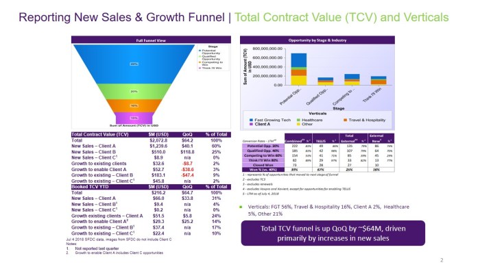
Power BI MS Excel Financial waterfall bar graphs (Swipe Next) 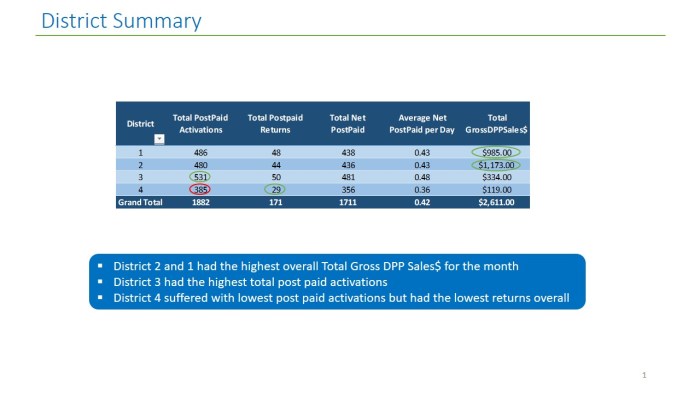
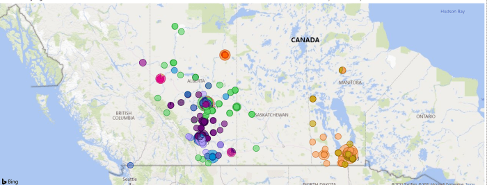
Power BI MS Excel Performance Sales tracking by district (Swipe Next) 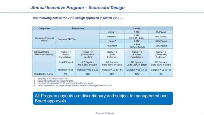
Power BI MS Excel Corporate Scorecard Dashboard (Swipe Next) 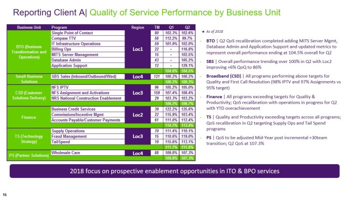
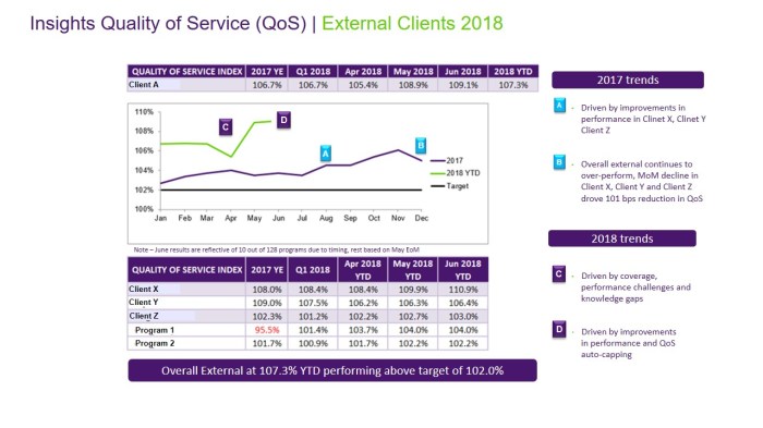
Power BI MS Excel Quality of Service Dashboard (Swipe Next) 
Power BI MS Excel Budgeting for Annual Incentive (Swipe Next) 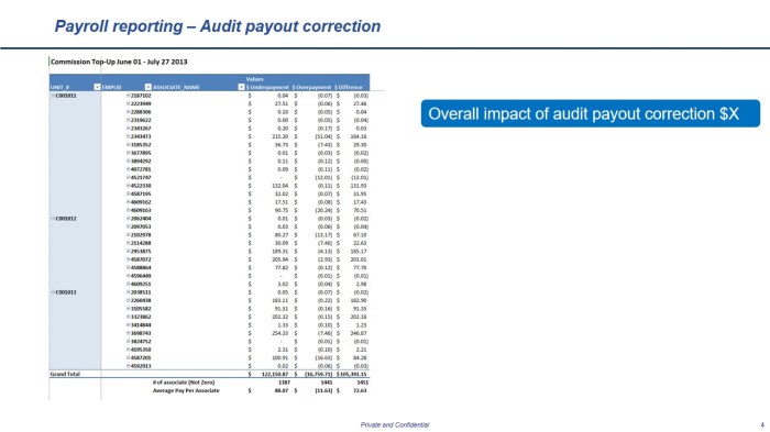
Power BI MS Excel Payroll Audit (Swipe Next) 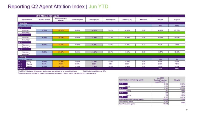
Power BI MS Excel Turnover dashboard (Swipe Next)

